Reading a Europe weather map: clouds, wind, and data times explained
Read Europe weather maps with confidence: distinguish satellite images, radar, and forecasts, then compare times, wind levels, units, and legends.
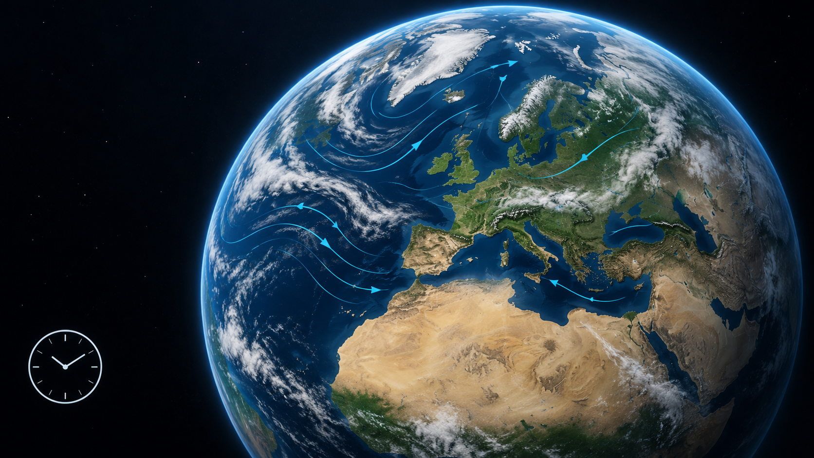
One weather map shows a broad cloud band over the Atlantic. Another shades the same area blue, while a third adds curved lines. Are they all showing the same rain? Not necessarily. The map type, time, atmospheric level, and legend tell you what you are looking at.
Checking those details first makes it easier to choose a useful map and compare it with another one. A moving animation or the word “live” cannot tell you the whole story.
Start with the question, then choose the map
Do you want to see where clouds are now, follow precipitation, or check how the wind might change this afternoon? Each question calls for a different kind of information.
| Map type | What it represents | When it helps |
|---|---|---|
| Satellite image | Radiation detected from space; depending on the channel, visible cloud structures or infrared information | Following large-scale cloud patterns and their development |
| Precipitation radar | Information about precipitation derived from radar echoes | Tracking precipitation areas and their movement |
| Model or forecast map | Calculated weather variables for a specified time or period | Comparing future wind, temperature, cloud cover, or precipitation |
A weather chart can also combine several variables. For example, the German Weather Service’s Europe chart is explicitly a forecast, with pressure patterns, temperature zones, fronts, and weather symbols. It is not a satellite photograph.
Likewise, a colorful cloud map may show model-generated cloud cover rather than satellite observations. Read the data description, not just the layer name.
Clouds do not directly tell you rainfall amounts
Satellite imagery provides a useful overview: cloud bands across the Atlantic, breaks in the cloud cover over land, or extensive cloud fields over northern Europe. As NOAA explains, satellite sensors detect radiation at different wavelengths. An infrared image is therefore different from an ordinary daylight photograph.
A bright area does not directly reveal how much rain reaches the ground at a particular place. Cloud imagery and precipitation maps answer different questions.
Radar sends out radio waves and analyzes the returned signals. In a reflectivity product, dBZ describes the strength of that return. NOAA notes that radar does not directly measure rainfall intensity. Rainfall rates are estimated from the signal; they are not a perfect rain-gauge reading for every backyard.
Use cloud imagery to examine cloud distribution. For a precipitation question, choose a clearly described radar or forecast product and read its legend.
Which time does the map describe?
“Opened just now” does not mean “observed just now.” Weather maps can carry several different times:
- Observation time: When was the satellite image or radar scan recorded?
- Model initialization time: What starting state was used for this forecast run?
- Valid time: What time does the calculated map describe?
- Period: Is the value instantaneous, hourly, or a daily total?
- Page access time: When did you load the website? That tells you about your visit, not necessarily the weather data.
A morning model run may produce a forecast valid for the evening. Looking at it in the evening does not turn it into an evening observation. Similarly, an hour-old satellite image remains a past observation even when the website is available now.
Check the time zone as well. Meteorological products often use UTC, also written as Z. UTC does not change for daylight saving time. For a simple example, if the local offset at the location is UTC+2, then 12:00 UTC is 14:00 local time. Keep the date and the location’s actual offset in view rather than assuming the map uses your own clock.
Levels and units: blue does not always mean the same thing
A color only has meaning within its scale. Blue could represent temperature, wind speed, or precipitation on different maps. Even two temperature maps may use different color ranges.
Check four details before comparing:
- Variable: Temperature, cloud cover, wind speed, pressure, or precipitation?
- Level: Near-surface wind or wind higher in the atmosphere? Temperature near the ground or aloft?
- Unit: For example, °C, km/h, m/s, knots, hPa, mm, or mm/h?
- Time definition: An instantaneous value, average, peak gust, or accumulated amount?
The Open-Meteo documentation gives concrete examples: temperature at two meters, wind at ten meters, and wind on pressure levels are separate variables. A pressure level is not a fixed height above the ground everywhere.
Two millimeters of precipitation over an hour is different from a rainfall rate of 2 mm/h at a particular moment. One is an accumulated amount; the other is an intensity. A peak gust is also different from an average wind speed.
Wind symbols need their own key. The direction the wind comes from is opposite to the direction it travels toward. For a detailed explanation, see why a westerly wind blows east.
An example: three maps that do not contradict each other
Imagine this fictional practice example for an area in western Europe:
| View | Label | What it tells you |
|---|---|---|
| Satellite image | Observed at 10:00 UTC | A cloud band covers the area |
| Wind forecast | Valid at 15:00 UTC, 10 m | Near-surface wind is shown for the afternoon |
| Precipitation forecast | 09:00–10:00 UTC, 0 mm | The model calculates no precipitation for that past hour |
Cloud cover does not automatically contradict the zero precipitation amount: they are different variables. The wind forecast refers to a later time. And the precipitation value is a model calculation, not a rain measurement collected afterward.
For a meaningful comparison, choose the same area and suitable times, separate observations from calculations, and then examine the patterns. An apparent mismatch may simply mean you have opened maps that answer different questions.
A six-step routine for reading a Europe weather map
- Define the question. Clouds now, wind later, or precipitation over a particular period?
- Check the source and map type. Observation, model output, or a combined presentation?
- Match the times. Read the data time, valid time, period, and time zone.
- Read the level and legend. Check height, units, colors, and symbols.
- Move from the overview to your area. Start with Europe and the neighboring Atlantic, then examine your region. Zooming enlarges the display; it does not automatically increase the resolution of the underlying data.
- Describe the comparison in one sentence. For example: “I am comparing two wind forecasts for the same area, level, and time.”
If that sentence is hard to complete, revisit the settings or data description. For a specific question about staying dry at a particular place later on, supplement the broad overview with a suitable local forecast.
Explore weather in geographical context with LiveGlobe 3D
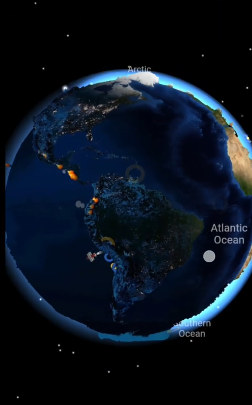
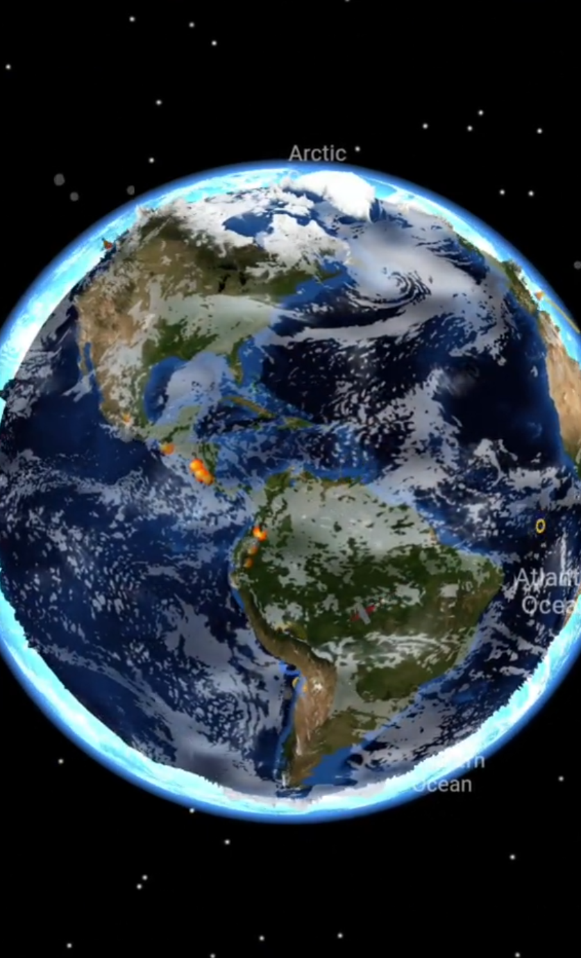
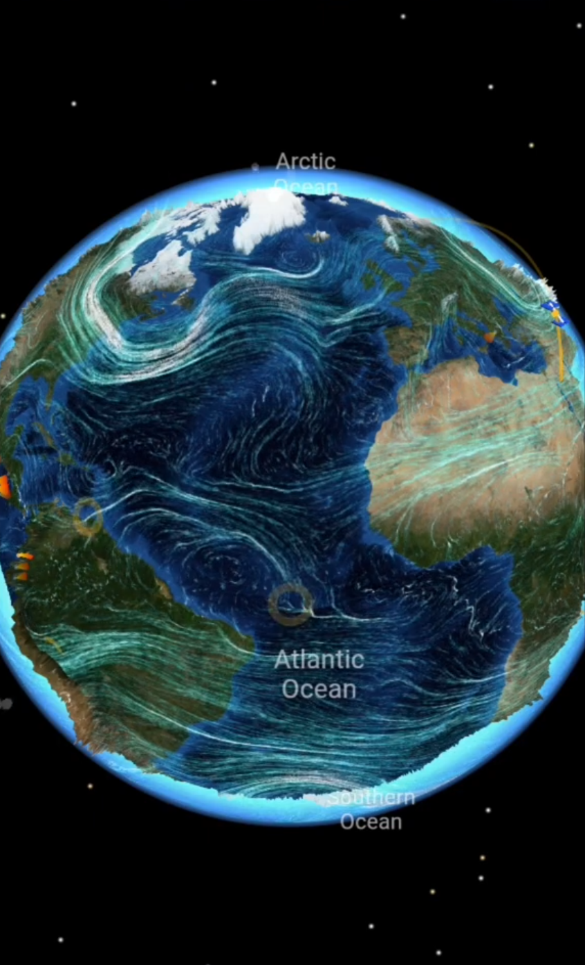
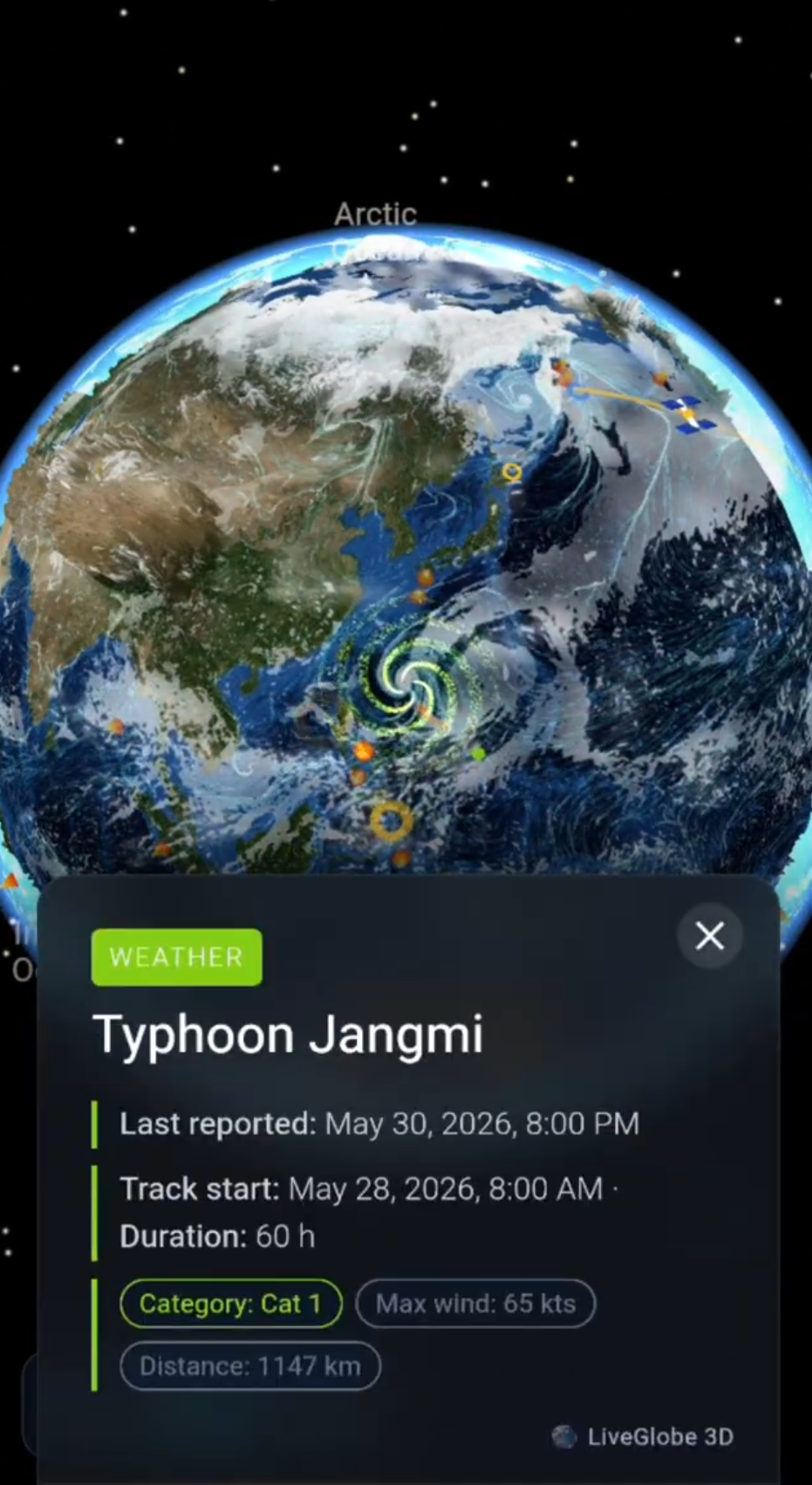
In LiveGlobe 3D, you can rotate and zoom the globe and switch on available cloud, surface-wind, upper-wind, or pressure views in the live menu. The web app has a sign-in requirement; these weather layers depend on premium access and external data.
Start with a familiar region and one layer. Relate the visible patterns to coastlines and continents. Then change the view and apply the same questions: Which variable is this? What time and level does it describe? Consult the relevant data source’s description when you need those details.
For more on location-based exploration, see weather forecasts on a 3D globe. Explore LiveGlobe 3D and the views available to you and try comparing Europe with the North Atlantic.
Common questions
Does a live Europe weather map show only recent measurements?
No. It may show regularly updated observations, current model values, or future forecasts. The data description and timestamp matter more than the word “live.”
Is a cloud map the same as rain radar?
No. A cloud map shows cloud structures or modeled cloud cover. Precipitation radar analyzes radar echoes. A bright cloud area alone does not answer a rainfall question.
Does zooming in make the forecast more accurate?
Zooming enlarges an area. It does not create new measurements or refine the weather model’s grid. Underlying resolution and a suitable local weather product matter more than the size of the image on your screen.
Short clips
The app in motion: short, genuine glimpses straight from use.
At a glance
How the app feels on your phone.